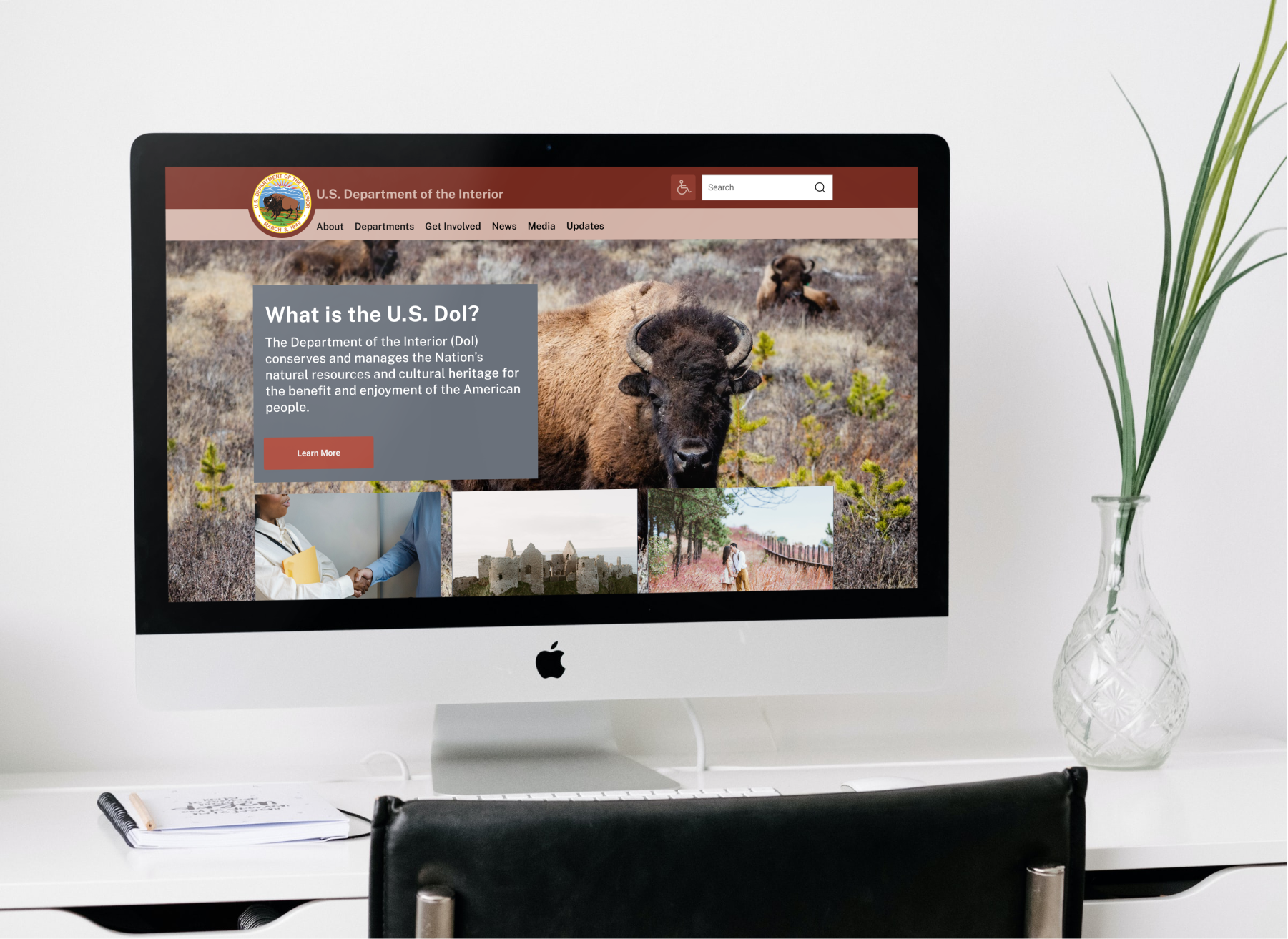
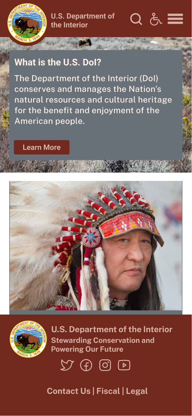
"The Department of the Interior plays a central role in how the United States stewards its public lands, increases environmental protections, pursues environmental justice, and honors our nation-to-nation relationship with Tribes."
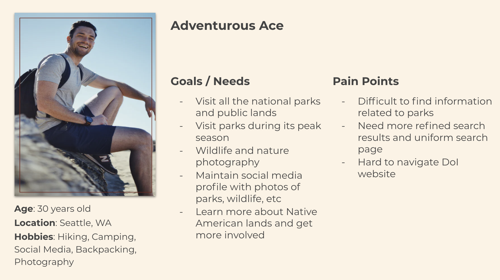
I started my process by reviewing and testing the usability of the current website, then brainstorming and discussed with peers who my users may be. Based on an assumption, I designed a Proto-Persona. Next, I moved to the interview plan and surveys outlines and sought out interviewees who fit my assumed Proto-Persona. As a result, I interviewed five users with questions structured around their experience planning trips to national parks and research processes. Finally, I conducted a usability test with them for the current DoI website. These interviews facilitated the development of the User Persona.
I synthesized the data I collected from the user interviews and usability testing into an affinity diagram. The process pointed out a trend of similarities between my interviewees and assessments. For example, the interviews I conducted showed that most users struggled to find adequate resources from official websites and tended to rely on third parties and quick Google searches. Yet, my analysis of the existing website showed that users did not understand how to navigate the DoI website. Some of them were even confused about what the website did. Therefore, I thought it necessary to address those specific challenges. Next, I expanded my findings, completing a Storyboard, Empathy Map, User Journey Map, User Scenario, Heuristic Evaluation, Color Assessment, Mood Board, and User Flow.
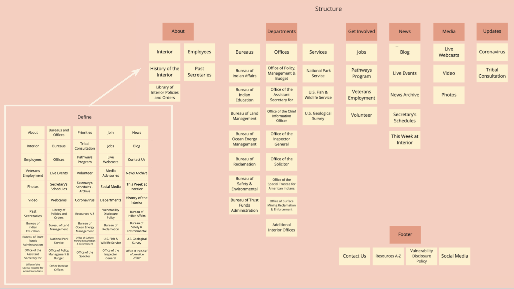
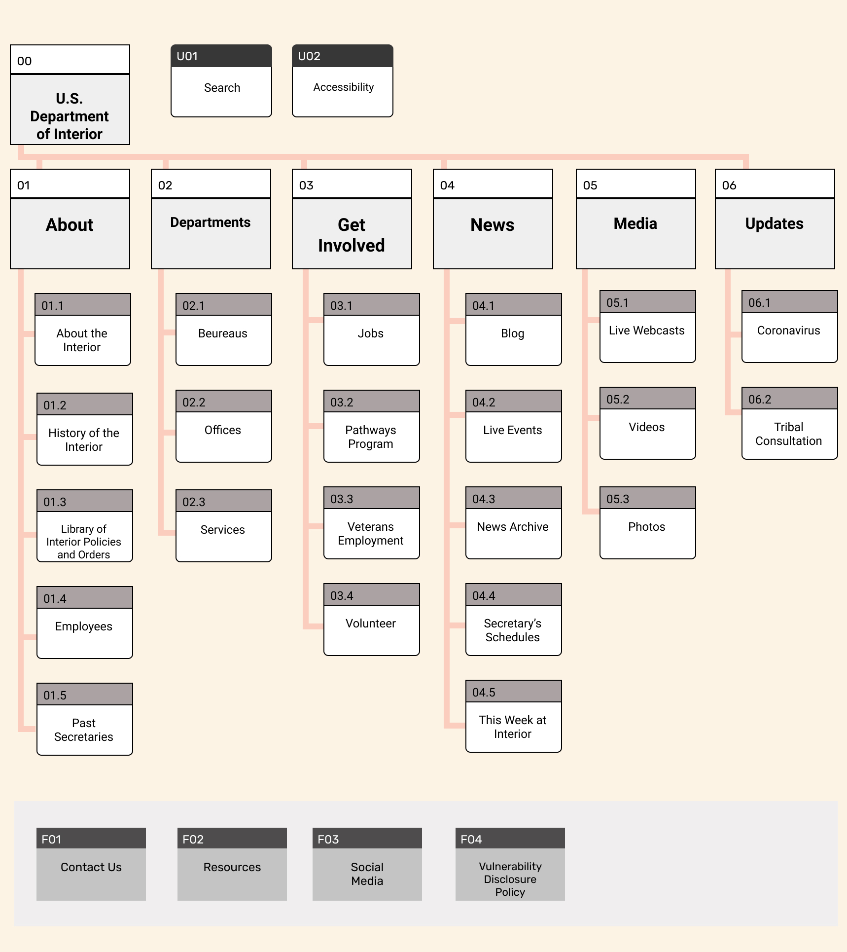
Expanding on the Heuristic Evaluation, the new website needed to reflect my findings regarding difficult navigation and confusion with the website. I decided to do some card sorting to make sure the site layout was optimal. Once I finished card sorting, I moved confidently forward with the site layout and testing outcome. Finally, I decided to put these findings into a Site Map to help navigate the page designs effortlessly.
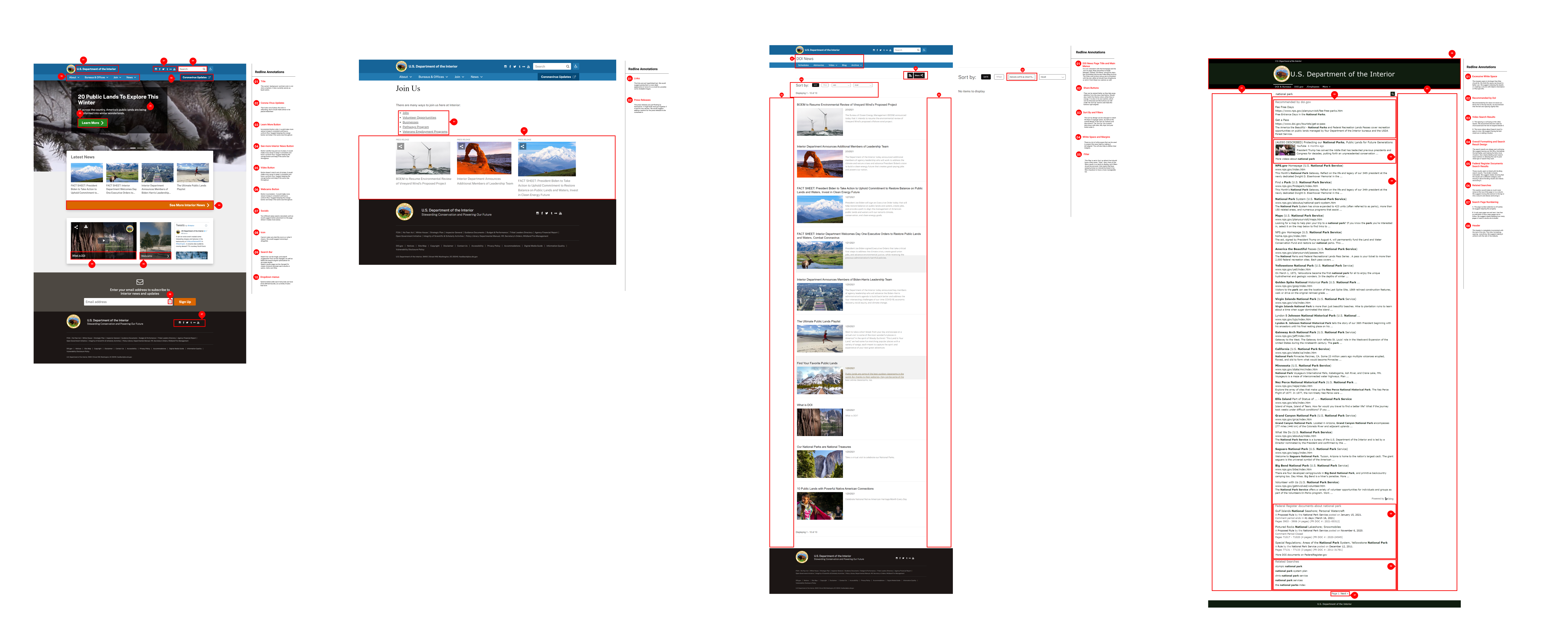
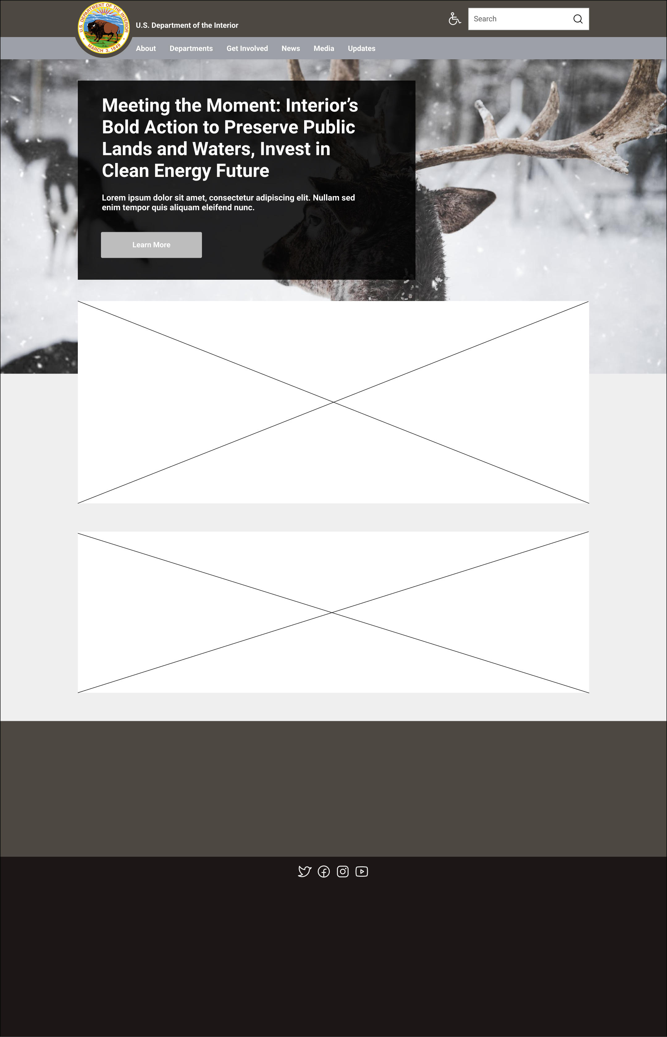
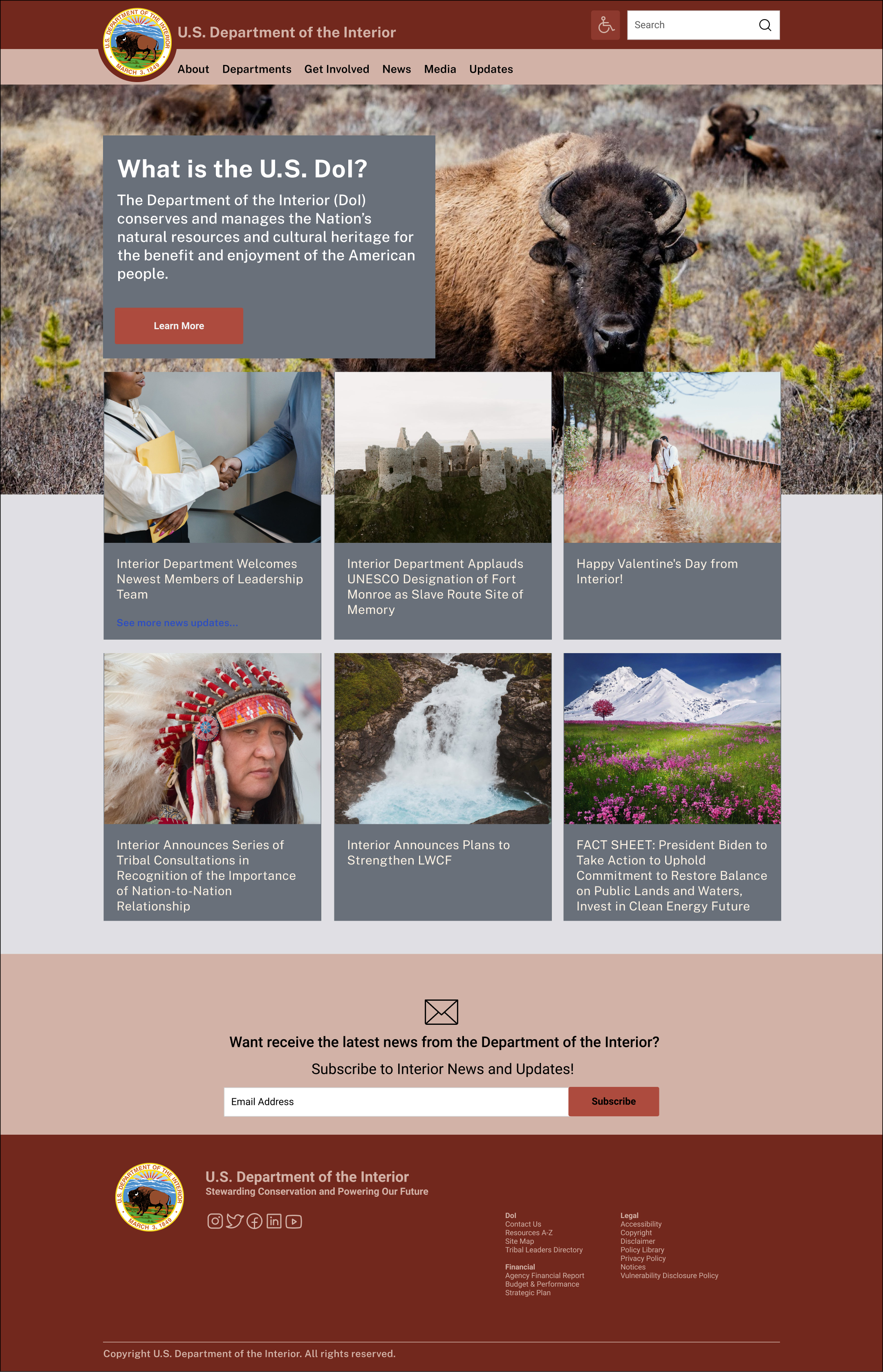
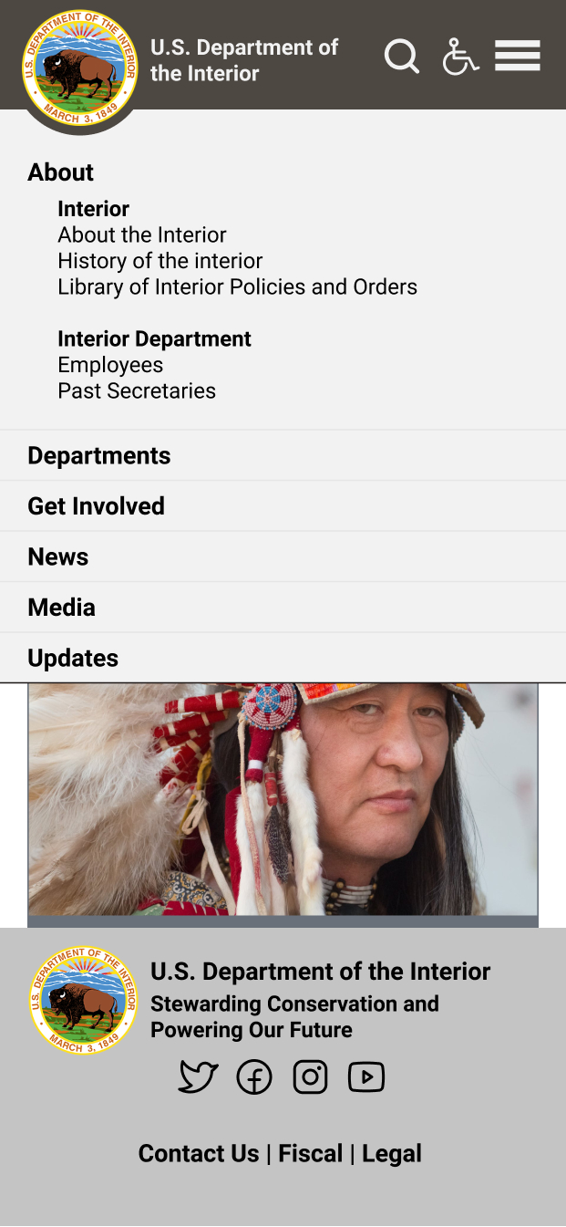
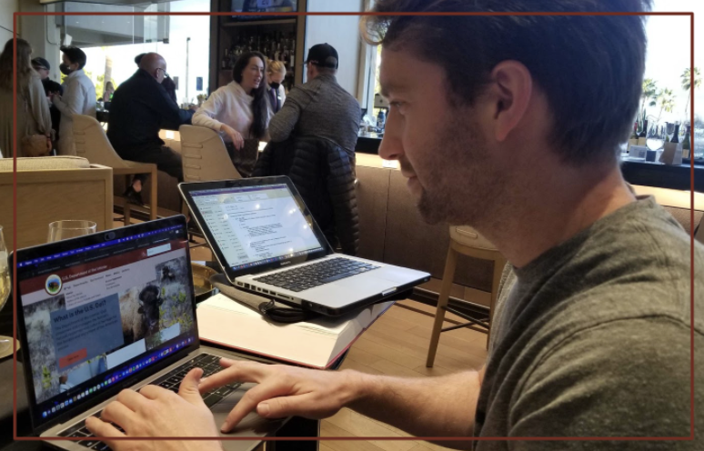
When I was comfortable with my user flows, I started prototyping. I started by hand sketching wireframes, and then I made the wireframe sketches clickable and tested them. The testing helped me make essential iterations, expand on strengths, and revise some of my strategy. Once I was satisfied with my direction, I began digitizing the desktop wireframes. I made sure to start creating a Style Guide as I went to prevent extra work and streamline the process. Next, I followed the desktop wireframes with responsive app wireframes. Finally, I tested each of the sketch wireframes, low fidelity wireframes, and high fidelity wireframes with test users.
I recruited five test users to help with each testing session. I received some helpful user feedback from our test groups, and they pointed out places where the logic jumps and process needed iterating.
If you like what you see and want to work together, get in touch!
Schedule Chat